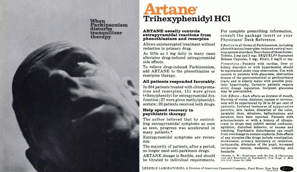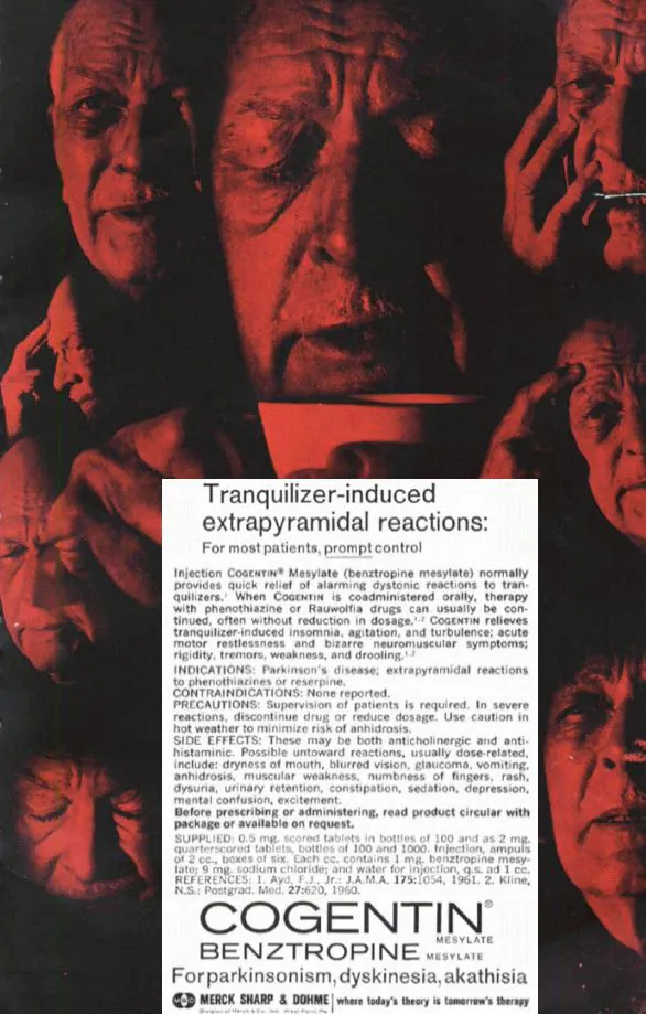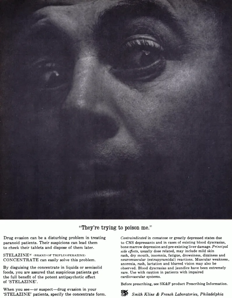
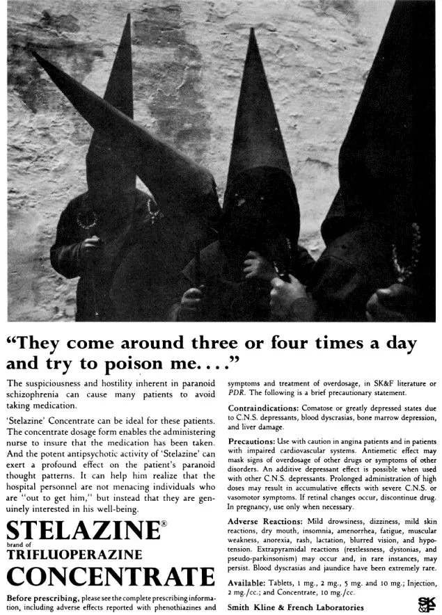
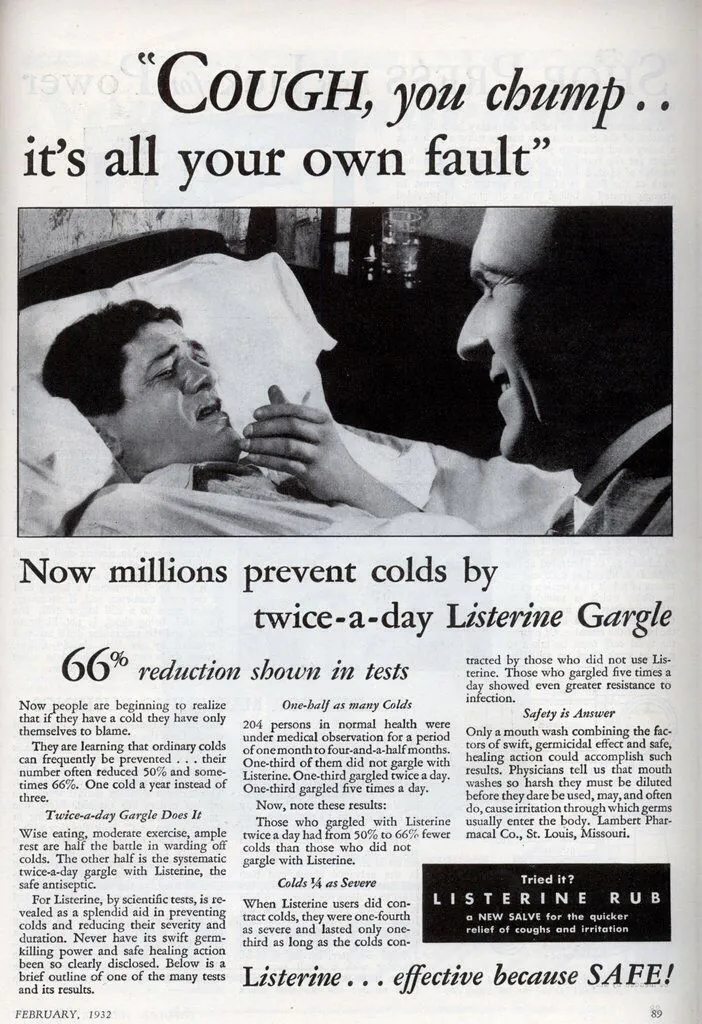
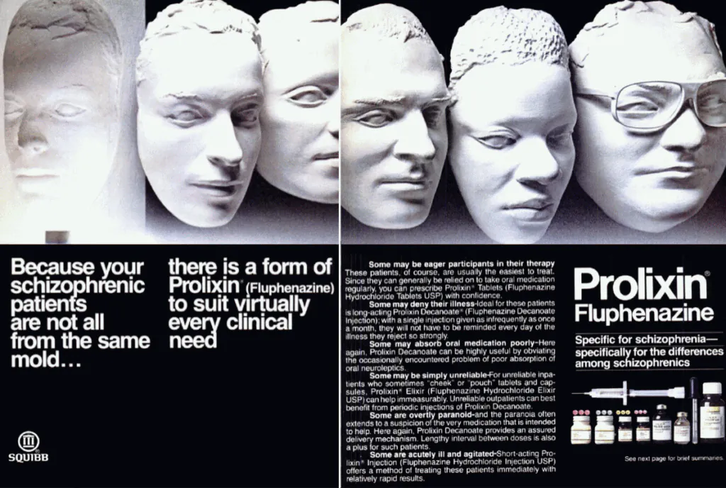
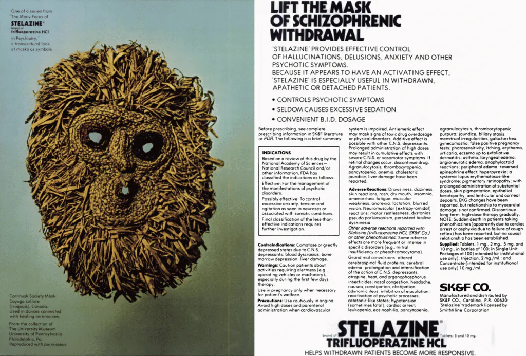
In the postwar era, pharmaceutical print advertising, especially for psychiatric drugs, was blunt, graphic, and often disturbing, using fear and medical authority to sell chemical control to doctors rather than comfort to patients. Innovative graphic design of the time often met with imagery that was anything but subdued.
From the 1950s through the early 1980s, pharmaceutical advertising existed in a strange, often brutal visual universe, one that assumed its audience could stomach distress, pathology, and a certain clinical frankness, and yet there’s something very visually appealing about them, medical horrors aside. As seen with the examples here, these were not lifestyle ads, they were blunt instruments. Visually, they’re a striking visual artifact of a very different era of western medicine, and some of the imagery is nonetheless very bold, standing in a category of its own for its time, and the late 20th century was no stranger to provocative print ads.
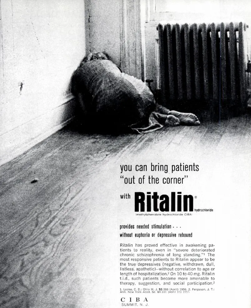
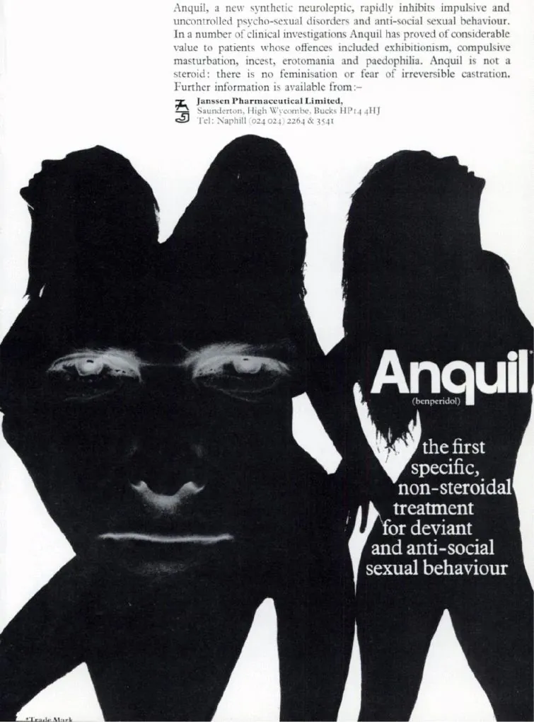
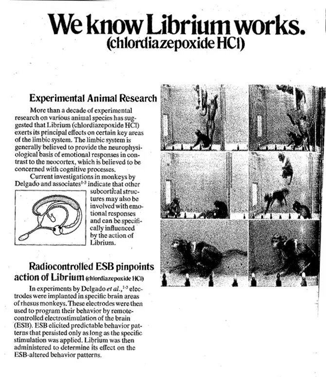
Decades ago, drugs like Thorazine, Librium, and Ritalin were introduced not as enhancements, but as chemical interventions for visibly broken minds, and these ads would convey that in a way that seems brutally frank and graphic to modern expectations. This being the past, the ads would suggest treatments and boast of practices that are today understood to be unethical or outright cruel, such as electroshock therapy and live animal testing.
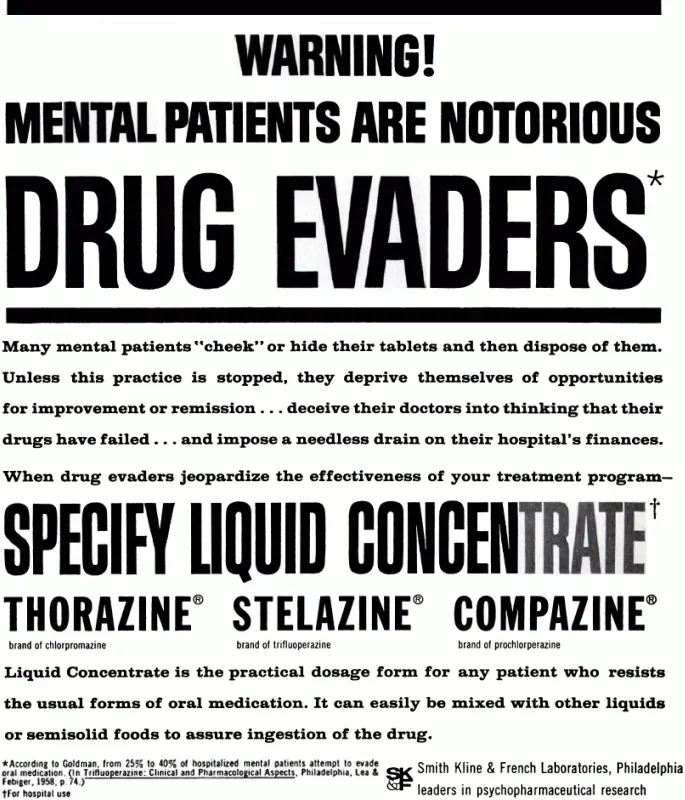
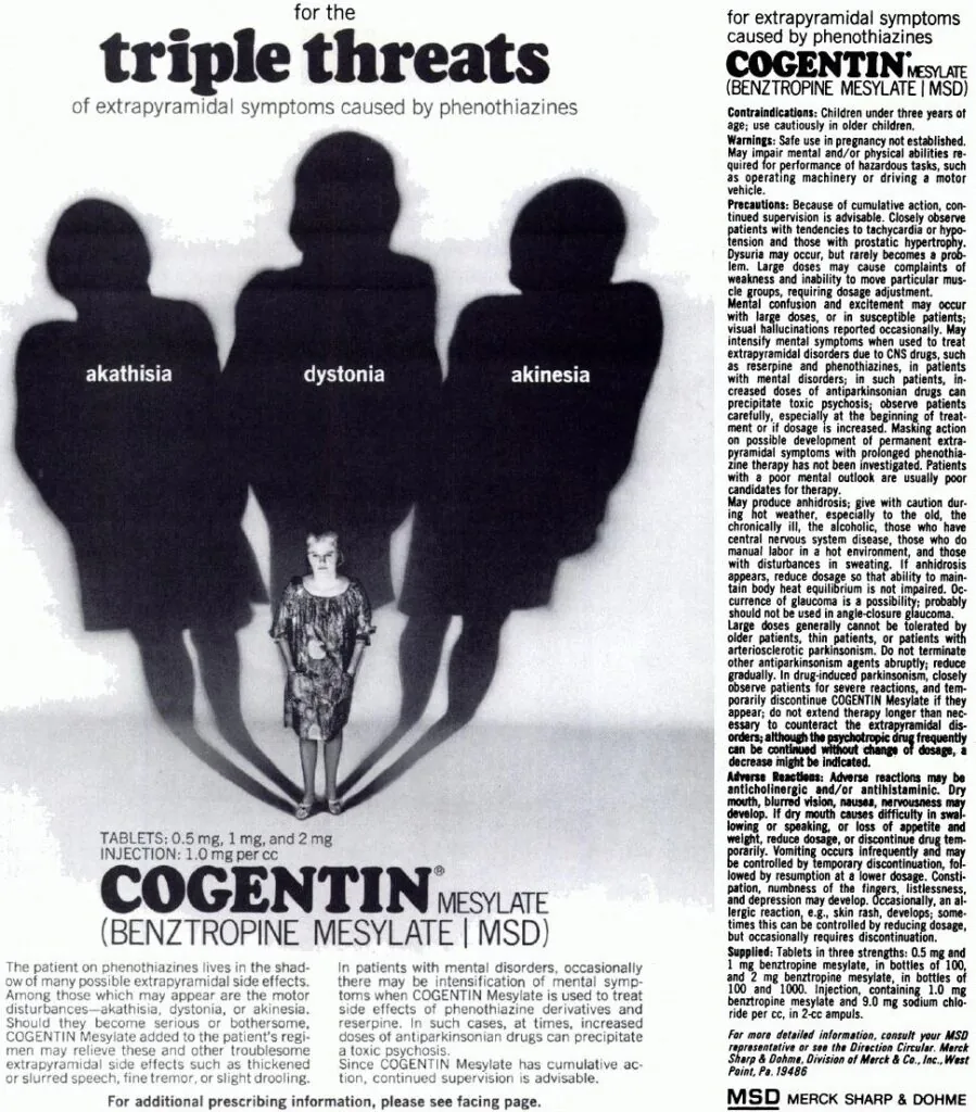
Much of this advertising comes industry literature, which was aimed directly at physicians, not the public, which partly explains the unfiltered tone. The ads leaned heavily on medical authority and fear: untreated illness was chaos, institutionalization, and social failure. Thorazine ads promised order and compliance; Librium smoothed the sharp edges of modern life; Ritalin framed restless children as problems to be managed.
This was the age of print medical journals being the primary carrier of information for medical professionals, where pharmaceutical companies competed fiercely for attention in dense, text-heavy publications read by clinicians who needed to know which treatments were best for their patients. An estimated 90% of advertising at the time was directed towards doctors instead of patients. Thus, in the midst of heavy competition, ad had to shock to be noticed. Graphic imagery, exaggerated pathology, and stark before-and-after contrasts functioned as visual shorthand.
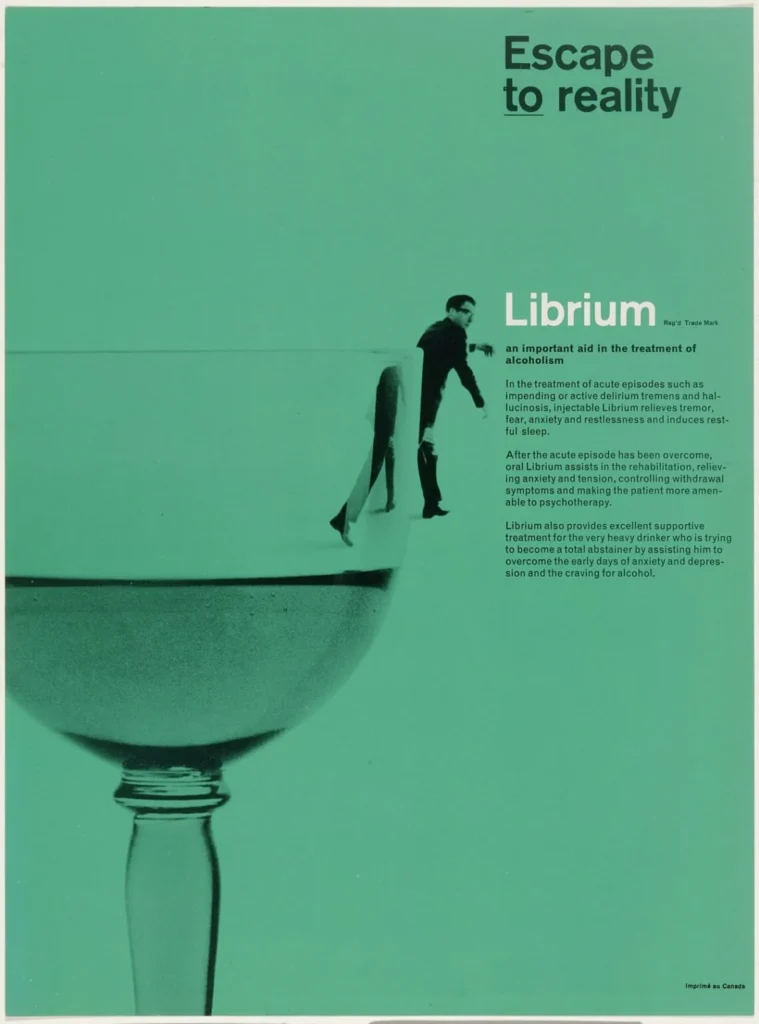
The artwork, often drawing from the same pulp traditions that horror movie posters of the time used, was graphic, moralizing, and sometimes genuinely disturbing. At the same time, innovative and forward-thinking graphic designers were usually commissioned to complete the work, resulting in visually striking design that still seems to come off as very modern, despite the contrast with the decidedly outdated contents of the ad copy itself. Rolf Harder, an important Canadian graphic designer, is one such name who had pharmaceutical clients, his work on a 1963 ad campaign for Librium, a treatment for alcohol withdrawals, being a particularly notable example of his portfolio.
Many of these examples came from an online archive of vintage advertising from the Bonkers Institute for Nearly Genuine Research, a satirical website that seemingly aims to bring to light the excesses and errors of the modern medical industry. Despite some of the innovative design, it was still not enough to keep these advertisements sustainable, and eventually the industry would begin a shift away from this aesthetic in the late 1970s that accelerated through the 1980s and 90s. Several forces converged: tighter advertising regulations, growing ethical scrutiny around psychiatric medication, the rise of consumer-directed drug marketing, and a broader cultural discomfort with stigmatizing mental illness.
To understand why this earlier advertising took the tone it did, it helps to remember the medical and cultural context in which it was produced. Postwar psychiatry was still heavily institutional, hierarchical, and paternalistic. The dominant assumption was that doctors knew best, patients were largely passive subjects, and mental illness was something to be corrected, contained, or subdued. Advertising reflected this worldview. The patient rarely spoke; the physician was the implied protagonist. The image existed to reinforce authority, not invite dialogue.
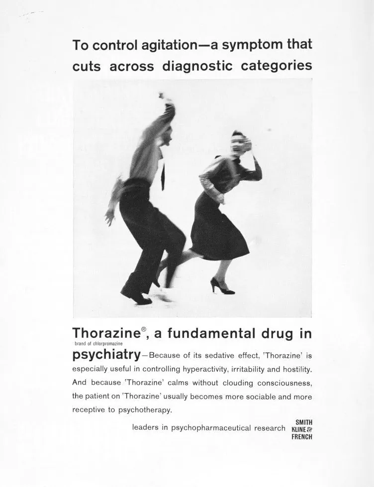
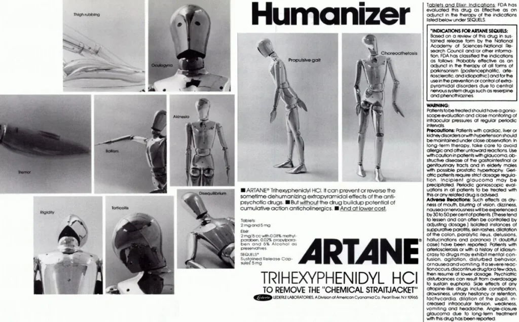
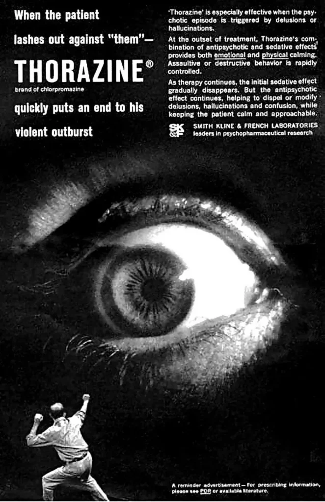
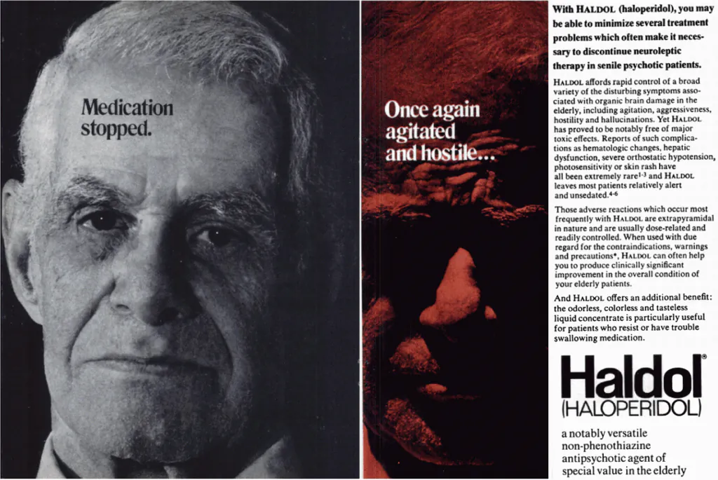
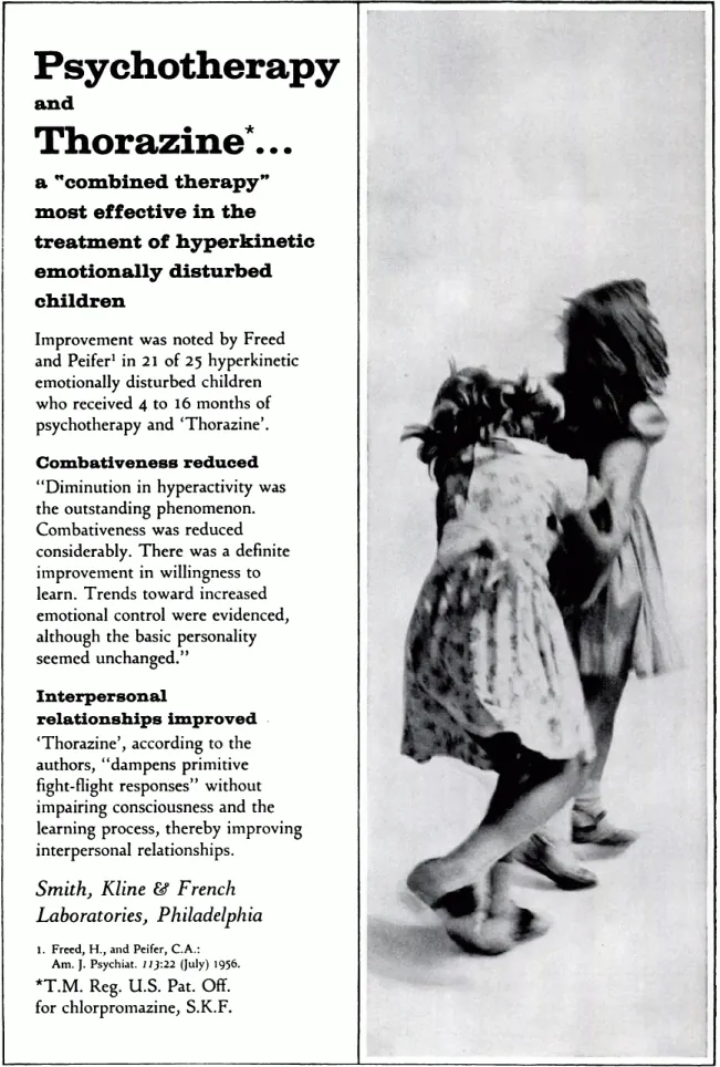
Thorazine’s arrival in the 1950s, often mythologized as the beginning of modern psychopharmacology, exemplifies this mindset. It was marketed less as a therapy than as a technological breakthrough capable of transforming institutions themselves. Ads implied shorter hospital stays, quieter wards, fewer restraints, and patients kept out of the hospitals in the first place. The emphasis was on efficiency, compliance, and control. In many cases, this was presented as humanitarian progress, even when the imagery suggested sedation as a substitute for care.
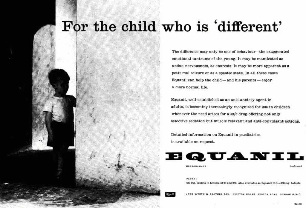
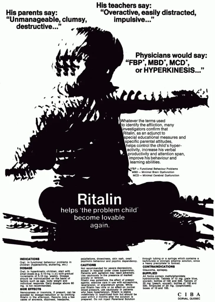
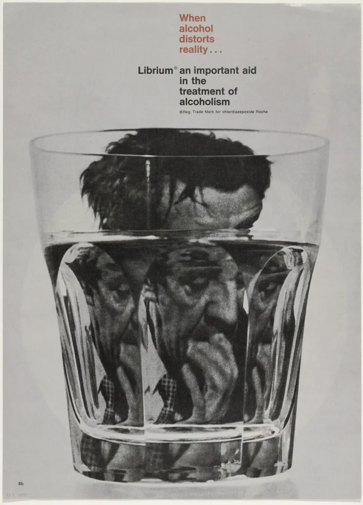
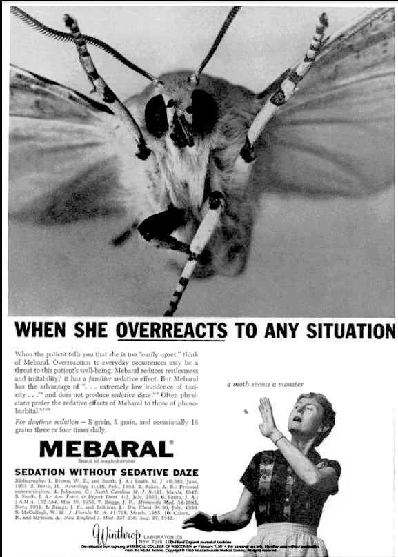
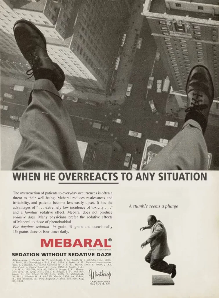
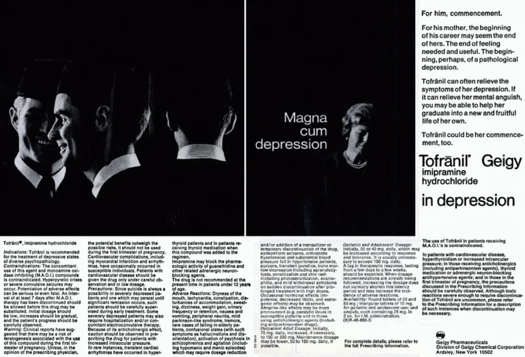
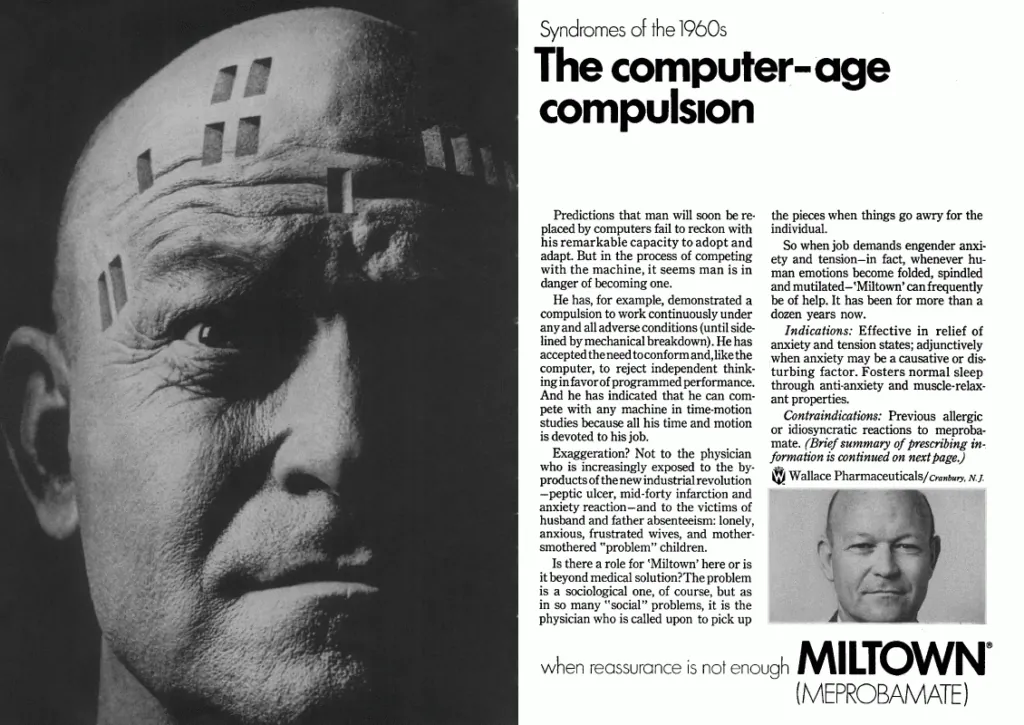
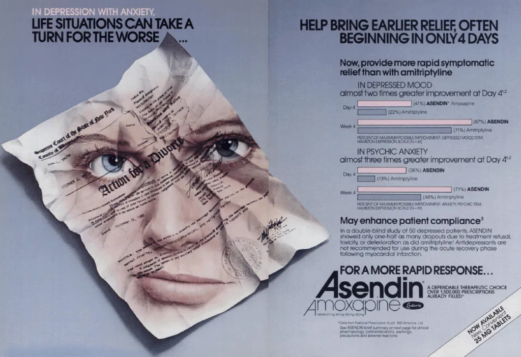
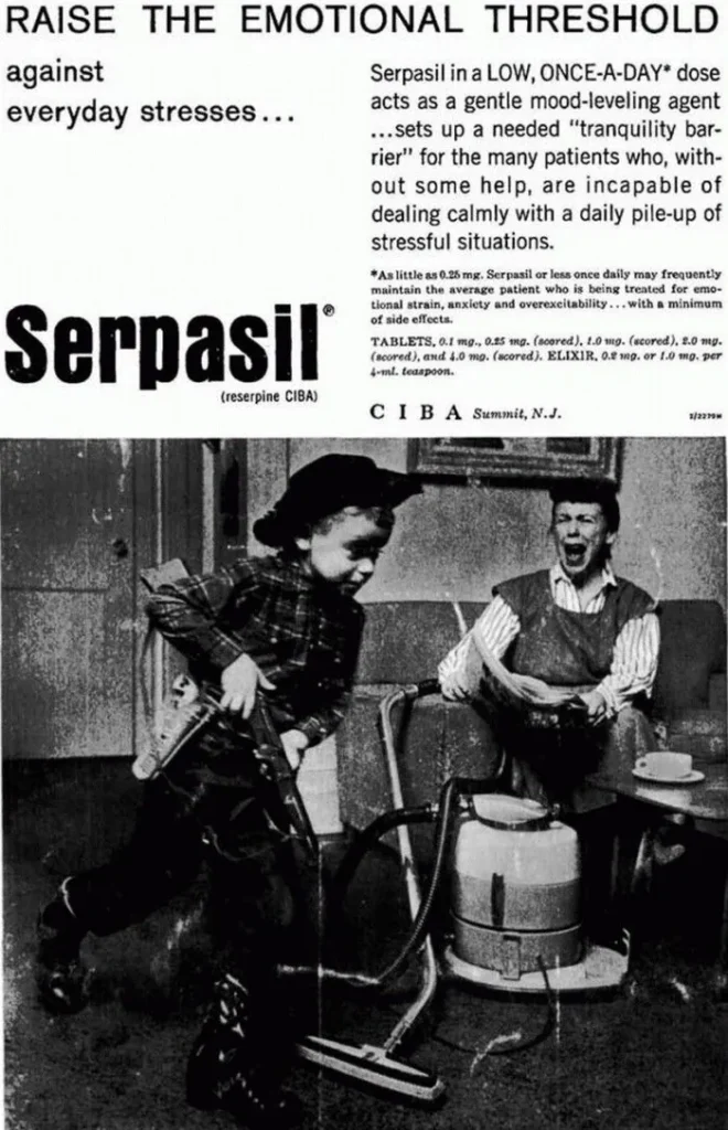
Librium and its successors extended this logic into everyday life. Anxiety, tension, and dissatisfaction, particularly among middle-class adults, were reframed as chemical imbalances requiring pharmaceutical correction. The ads often pathologized social roles: the emotionally “unstable” housewife, the “excitable” child, the overworked man, and so on. These depictions reinforced rigid norms while presenting medication as a way to return individuals to their expected function within society.
Ritalin advertising was perhaps the most unsettling in retrospect. Early campaigns frequently depicted the drug as a mild aid for tired housewives before shifting towards a strong therapy for restless children, depicting them as disruptive forces and classroom problems to be chemically managed. Restlessness and disobedience were medicalized with little concern for long-term consequences, developmental nuance, or consent.
By the late 1960s and 1970s, cracks began to appear in this system. The anti-psychiatry movement, exposés of institutional abuse, civil rights activism, and a growing skepticism toward medical authority all contributed to a cultural reckoning. The idea that distress might be socially produced, or that medication might cause harm, became harder to ignore. Regulatory bodies responded by tightening advertising standards, while lawsuits and investigative journalism made overtly aggressive claims riskier.
At the same time, pharmaceutical companies identified a new and far larger market: the patient-consumer. Direct-to-consumer advertising, first cautiously introduced and later aggressively expanded (particularly in the United States), required an entirely different tone. Pharmaceutical companies realized fear sold poorly to patients, even if it worked on doctors. Patients could not be frightened into compliance the way institutions could. They needed reassurance, relatability, and aspiration. It’s worth noting that to this day, the US and New Zealand are the only industrialized nations where direct-to-consumer advertising for prescription drugs is legally sanctioned.
The solution was a total aesthetic reversal, taking a cue from wellness vibes once pioneered by the hippie and alternative medicine movements, the pharmaceutical advertising world shifted to unadulterated positivity: sunny stock photography, joggers on beaches, smiling couples, and vague promises of “balance” and “well-being,” with the horrors relegated to side effects listed in fine print.
Thus began the era of pharmaceutical advertising as lifestyle branding. Mental health drugs were no longer presented as tools of control but as companions to self-fulfillment. Suffering was abstracted or not acknowledged at all. Illness became a soft-focus inconvenience rather than a crisis. The messaging shifted toward leisure, nature, and emotional neutrality. Where earlier ads screamed diagnosis, modern ones whisper possibility.
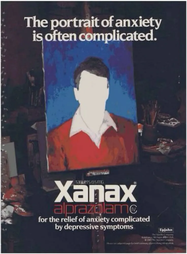
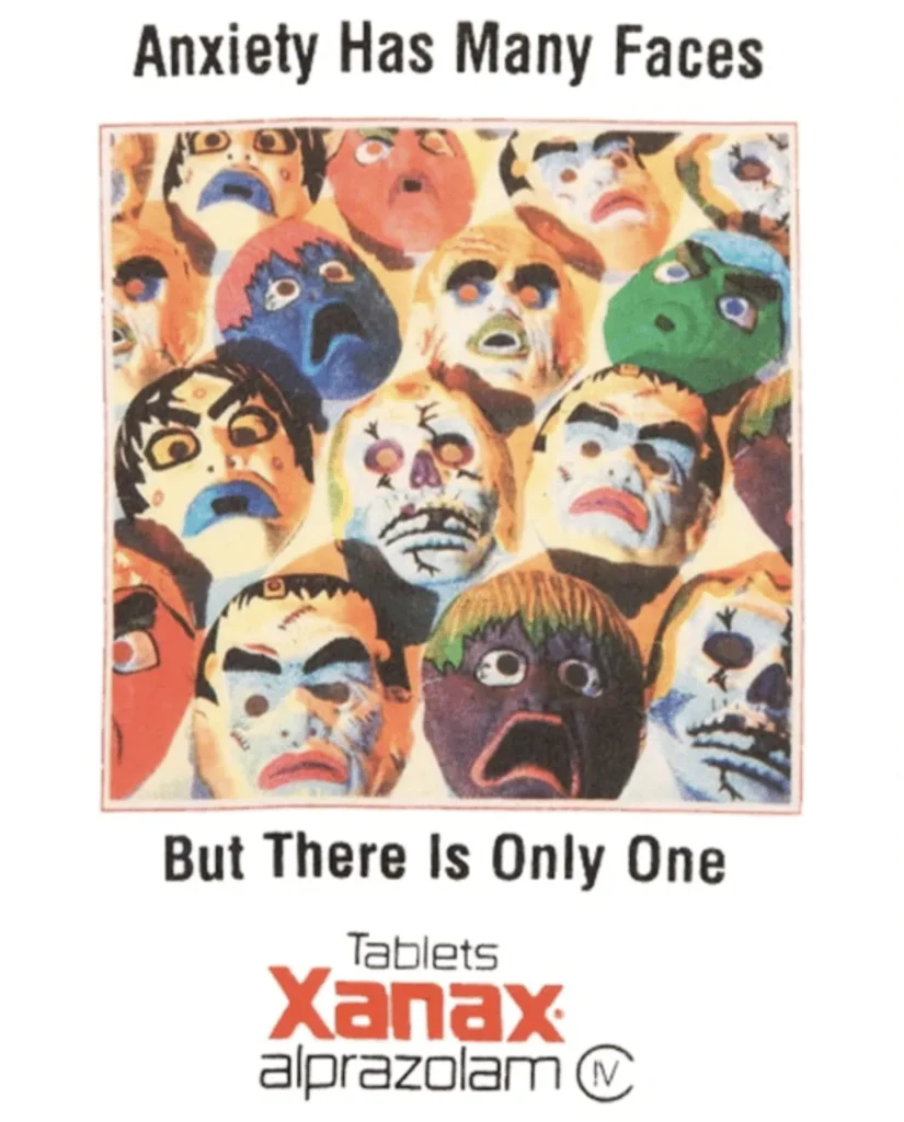
Yet this shift came at a cost. However, lost in the transition was the honesty, however crude, about what these drugs were actually for. In sanitizing the imagery, pharmaceutical advertising also obscured the seriousness of the interventions themselves. Side effects, risks, and the sheer power of these substances were buried beneath visual calm. The drugs did not become gentler, only their presentation did.
The grotesque honesty of early pharmaceutical advertising is unsettling, but it was also revealing. It showed, without much pretense, how society understood mental illness, authority, and control at the time. Today’s ads, by contrast, are designed to be forgettable: pleasant enough to pass unnoticed, reassuring enough to avoid questions, and made to be engaged with only by those that would need it.
What remains unchanged is the central paradox: medicine that can profoundly alter the mind continues to be marketed not as a serious intervention, but as a benign accessory to everyday life. The imagery has evolved, the language has softened, but the same powerful chemicals remain, only now they’re wrapped in the visual language of leisure, not crisis.